2019
Toolkit
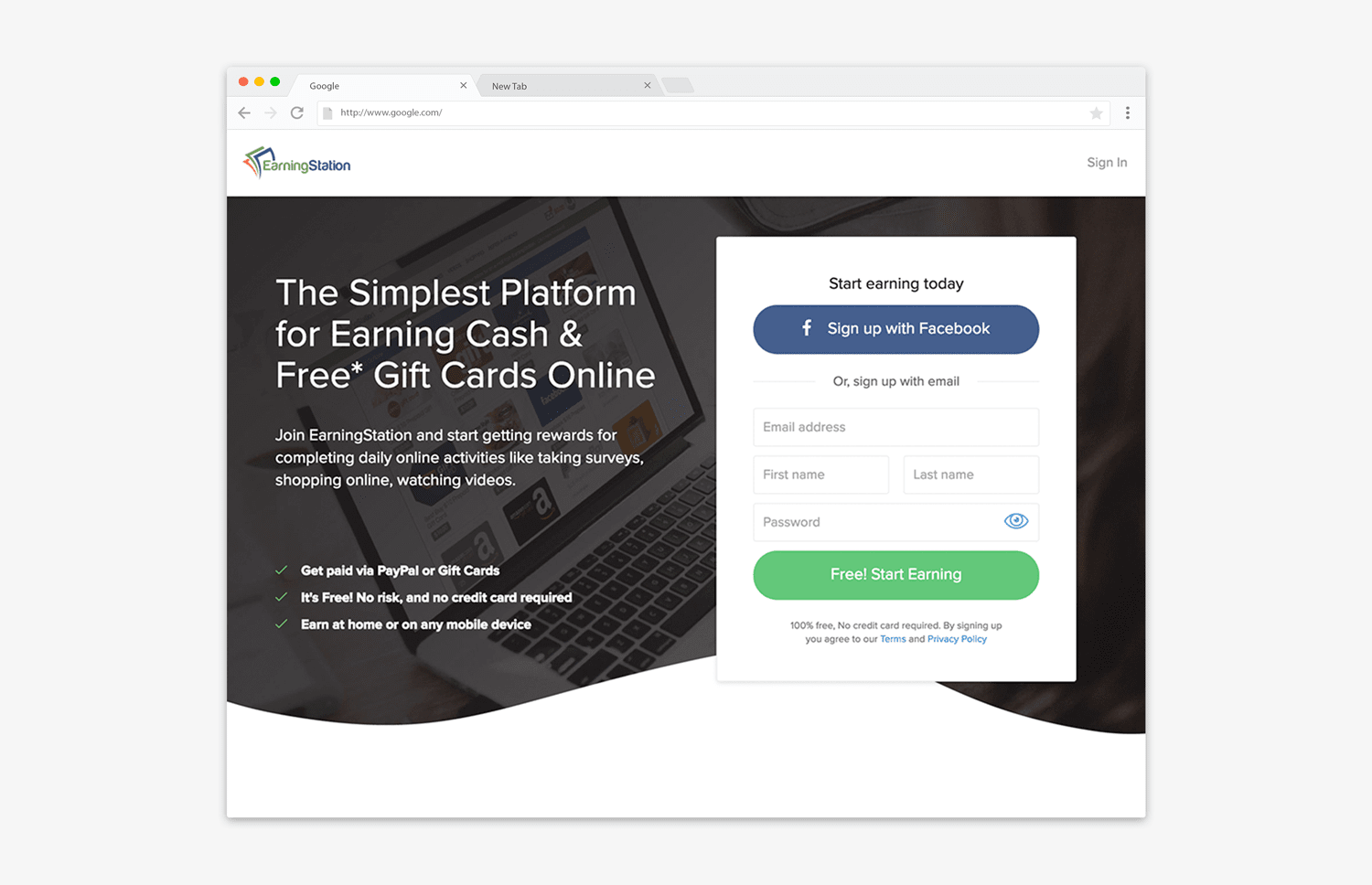
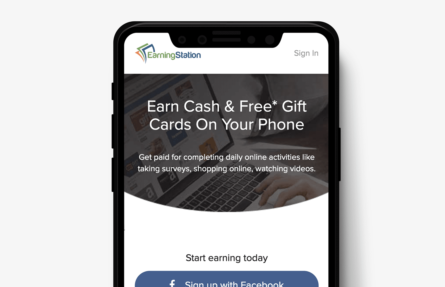
My goals were: to update the look and feel of the brand in order to express that EarningStation was a secure, reliable and trustworthy product that would be easy to use and rewarding for its users; to improve the registration experience and friendliness for users; and lastly, to deliver an exceptional design that was cross-browser friendly.
Years of research on landing page design meant I had a few tricks up my sleeve to incorporate at project onset. White space was going to be essential to this design. Although there are high converting and messy squeeze pages that work well, they come with inherent issues that are detrimental to long-term success. Modern users are becoming more savvy and they expect a certain level of design in order to trust a product. Further, the LTV of users accrued via a squeeze page is generally much lower than that of users gained from a content-focused, informative landing page that level sets user expectations.
Around this time, plenty of research came out putting to bed the old golden rule of “above the fold content is king” and I had seen the trend prove true with our own user base. Mobile devices and tablets were becoming the primary method of internet browsing and scrolling would be second nature to a vast majority of users.
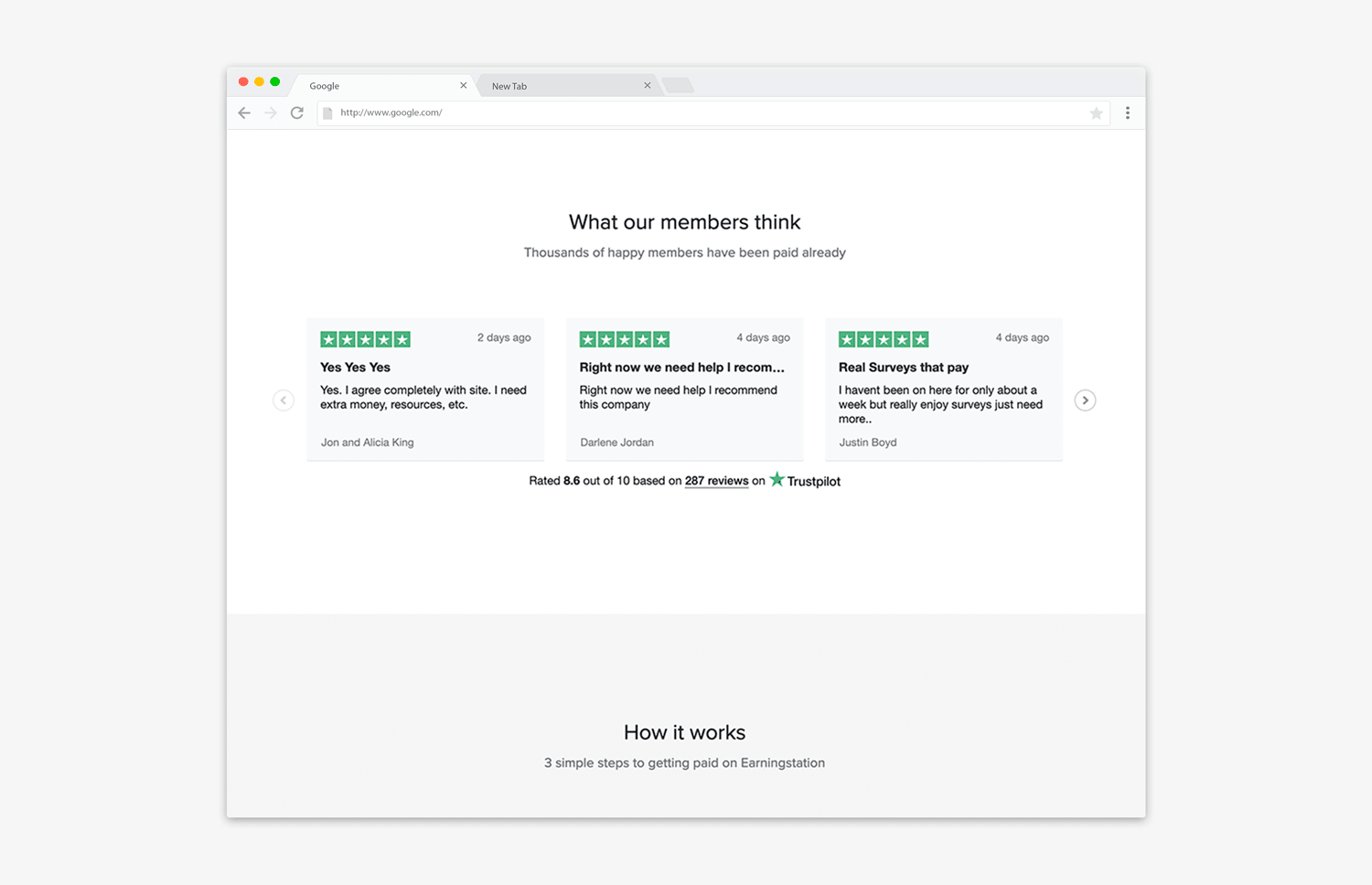
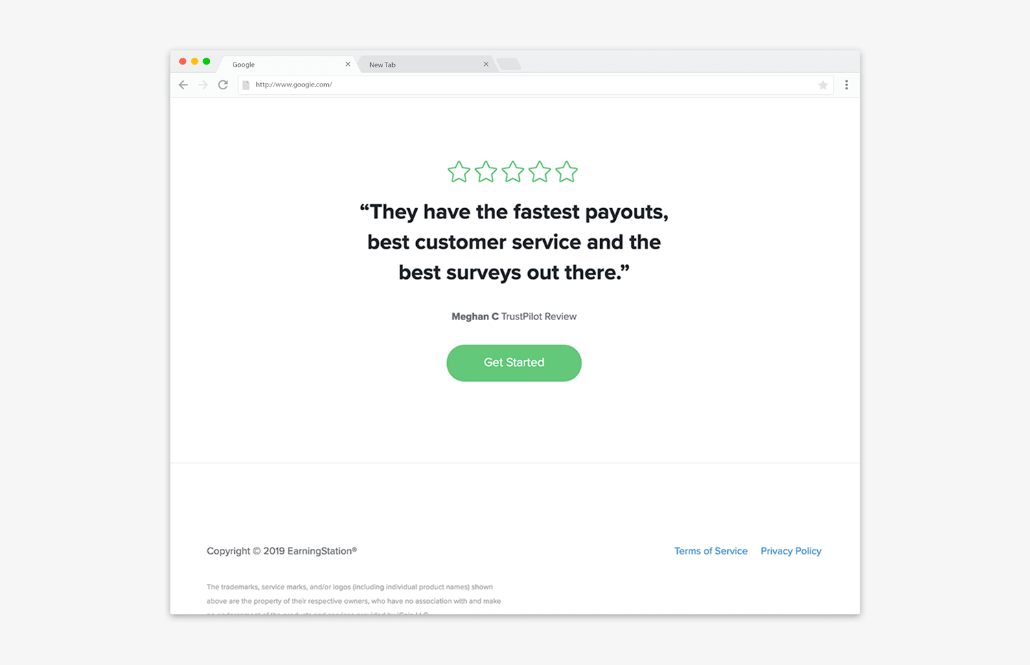
Expressing trustworthiness is the key to any good landing page—an awesome design is not enough. I needed to add third party testimonials that users could believe in. Having already worked on a deal between our parent company and Trustpilot, I added this brand to our package and worked with our support team to accrue a few hundred testimonials on their new Trustpilot page.
Keeping things simple for the user was the last key ingredient. I worked with our support team to write a succinct 3 step "How It Works" section.