2019
Toolkit
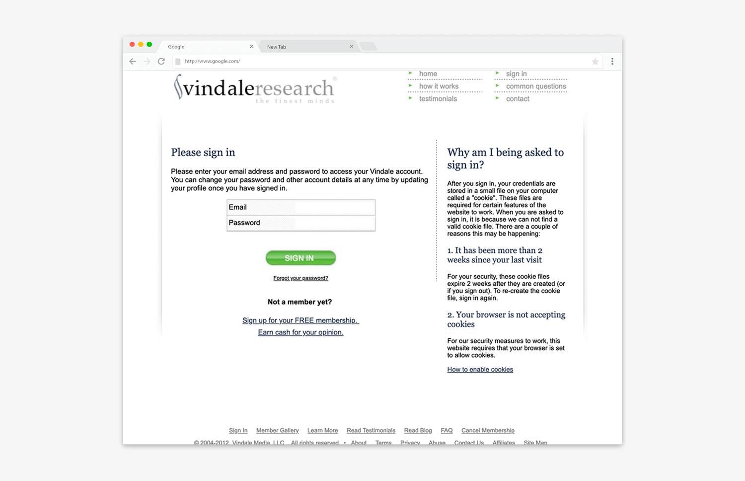
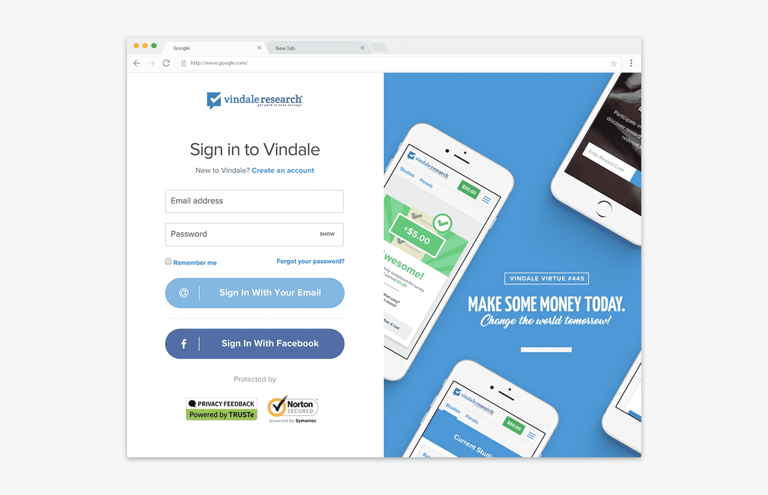
My goals were: to improve user experience by updating the interface- aesthetically and functionally, which would, in turn, reduce frustration and attrition rate for the page. I also saw an opportunity to extend our brand identity by making the page unique and consistent with our overall aesthetic. However, it was also important to maintain a familiar layout to avoid interrupting the users' expected interaction pattern for a login page.
First, I dug into the data we collected on user behavior. The login page had a high bounce and exit rate. However, those markers were spread evenly across a wide variety of devices and browsers, which indicated that the problem was a bit more complex than simply adding conditions for mobile devices or cross browser evaluation. Page load speed also clocked in well below average.
Needing more in-depth data, I implemented google analytics events on the page to track every error category occuring on the form. After collecting sufficient data, I found that password errors were uncommonly higher than others. Traffic also spilled over onto other pages linked on the login page, which, in some scenarios, would be fine, but not in the case of a login page. We needed to improve conversion rate (logins) by focusing the flow to a single family of possible interactions: login, password retrieval and registration.