Seafood Index


  • User experience
  • Front-end development
  • UI design

2020


Toolkit

I. Problems

  1. Lack of centralized information on the high-quality seafood we sell
  2. No existing catalog of all our products
  3. Missed opportunity to educate members
  4. Legal requirement to provide nutritional facts


II. Goals

  1. Easy to use index of all our products
  2. Consistency in presentation
  3. Categorized recipe links for inspiration
  4. Highlight benefits of Wild Alaskan seafood
  5. Increase in new members
"the site lacked a central hub that presented all of this useful information in an aesthetically pleasing and user-friendly manner"

III. Metrics

  1. Traffic to recipes section of our blog
  2. Inquiries into currently unavailable offerings
  3. Time spent by MX team educating members on recipes and cooking guides
  4. New members that viewed the seafood index before joining


IV. Notes

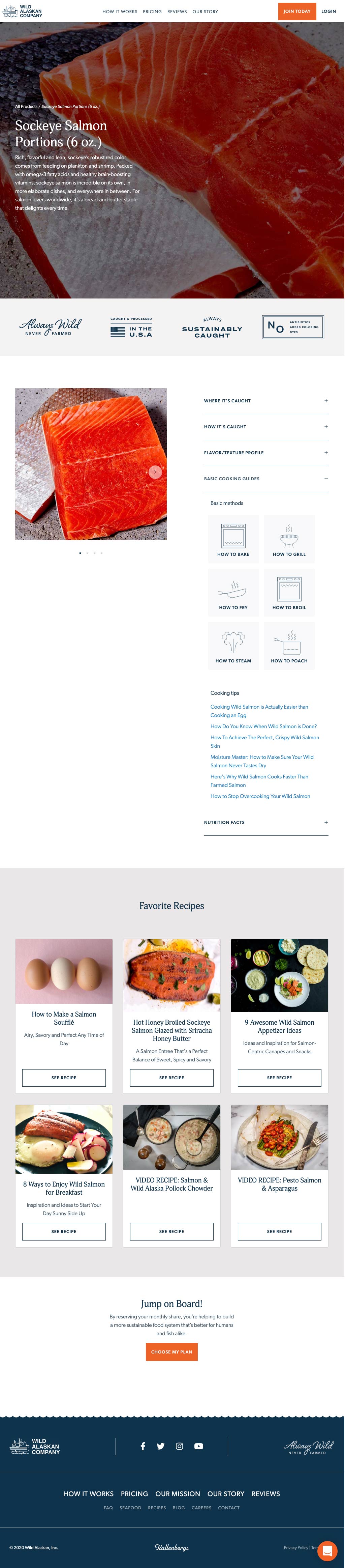
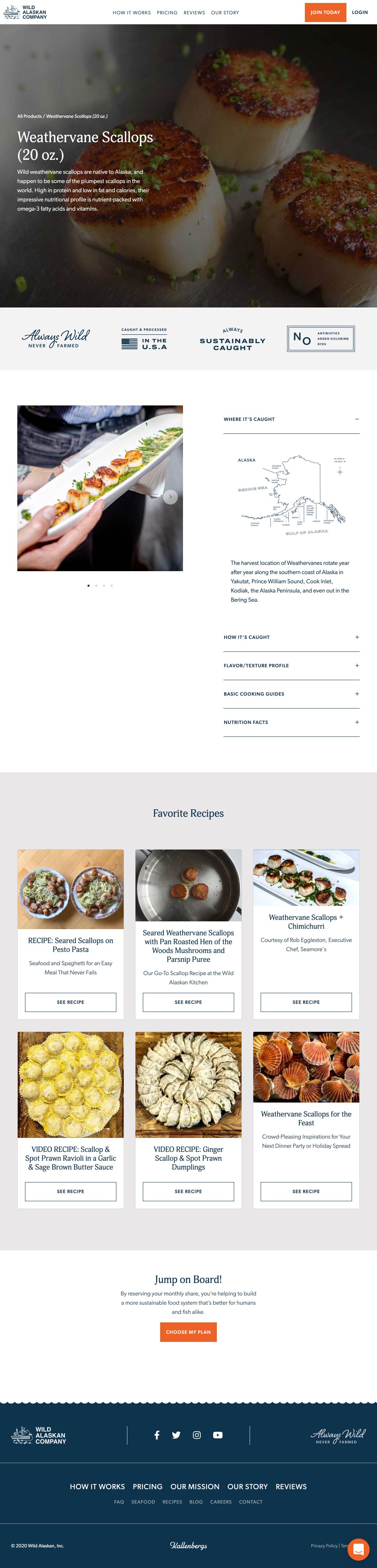
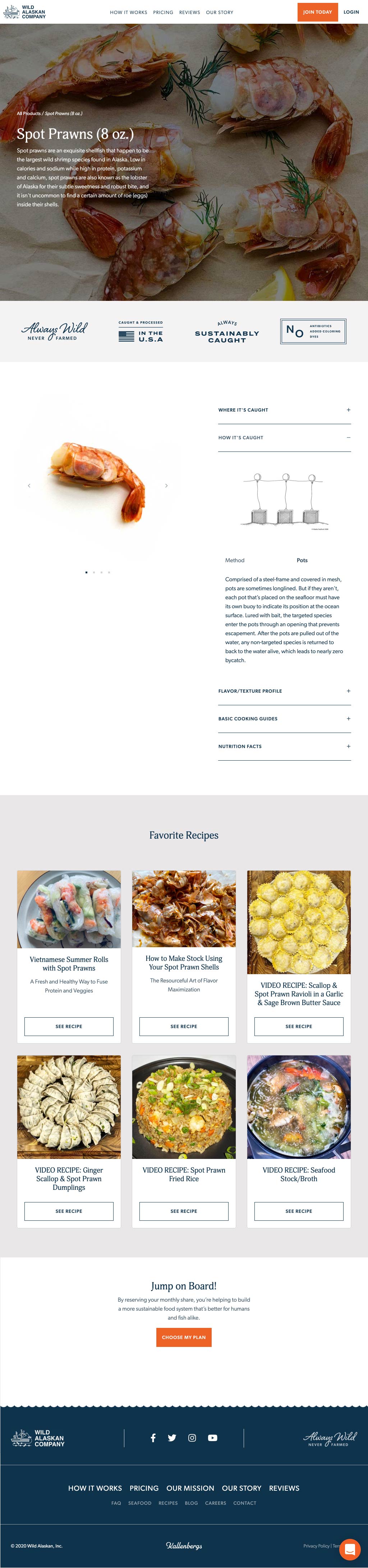
Originally, the task I was given was to find a way of incorporating nutritional facts into the member area UI. After some brainstorming, I realized this was an amazing opportunity to do so much more. The result would be the seafood index. Although our blog had a plethora of articles, information and recipes, the site lacked a central hub that presented all of this useful information in an aesthetically pleasing and user-friendly manner. Also, we were leaving so many interesting facts out that could educate and intrigue our members. For example, exactly where our fish was caught, the catch method and what that entailed, flavor profiles and more.


V. Design


VI. Conclusions

  1. Our seafood index has become incredibly popular with our members, many of whom reach out to let us know how much they appreciate the transparency and education we offer.
  2. Contributes to lead generation
  3. Increased traffic to recipes section of blog

Back to case studies