
2018
Toolkit
After reviewing internal data for day one users it became clear to our CTO that not enough users were completing their profiles after signing up. This was important because: in order to match users efficiently with surveys, we needed basic demographic profile data. Without that data, users were getting bounced from their first survey, which triggered a negative user experience and led to a high incidence rate of account abandonment.
My task was to significantly improve day one profile completions, which would improve the experience of new users by making it far more likely that they would qualify for and earn money from their first survey and then move on to more surveys and generate further revenue
I collaborated with our social media team to create a series of surveys and questionnaires to help us get a deeper understanding of the issues our new users were having. Our questions focused on frustrations users had when joining and with the survey-taking process in general. The results were somewhat shocking. The majority of respondents had serious issues when signing up, even users that became power users. When we did a follow-up survey to learn how users had gone about overcoming confusions as new users, we found that a majority had found outside resources for help, such as youtube videos and blog articles from fellow members.
Now at this point, it would be very easy to point a finger at our particular product and team and say "you idiots, you f*cked up!" But, after doing some thorough research on a long list of competitors, it became increasingly clear that this wasn't just an issue with our product, this was an industry-wide issue. I couldn't find a single example of a product in market research that was doing anything differently in terms of onboarding its users. Market research, in general, is a very insular industry full of jargon and processes that are industry-specific. This issue, in my opinion, arose from an industry with tunnel-vision that moved online before user experience was even a proper field. What I had discovered was: a golden opportunity to improve the user experience for our new users and significantly boost revenue.
My goal was to create an onboarding flow that accomplished the following:
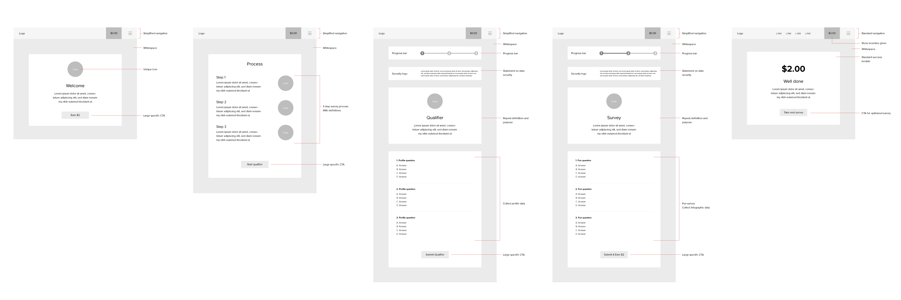
Our onboarding flow and tutorial had to be unique and tailored to our needs and those of our users. That being said, my first course of action was to research respectable competitors' onboarding flows. I also invested in research around modern standards and considerations for onboarding flow UX. Then, I compiled a list of pros and cons and insights gained from that research and combined it with my own ideas to begin wireframing the basic flow.
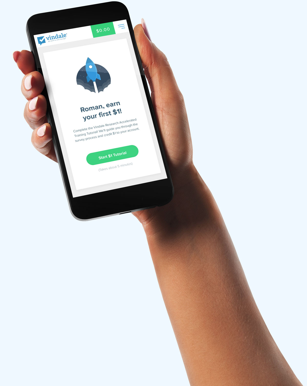
The first step would be to funnel users into the tutorial after finishing their registration. Completing the tutorial would be benefit the user, and if I did my job well, it would offer an enjoyable experience and a great way to start their membership.
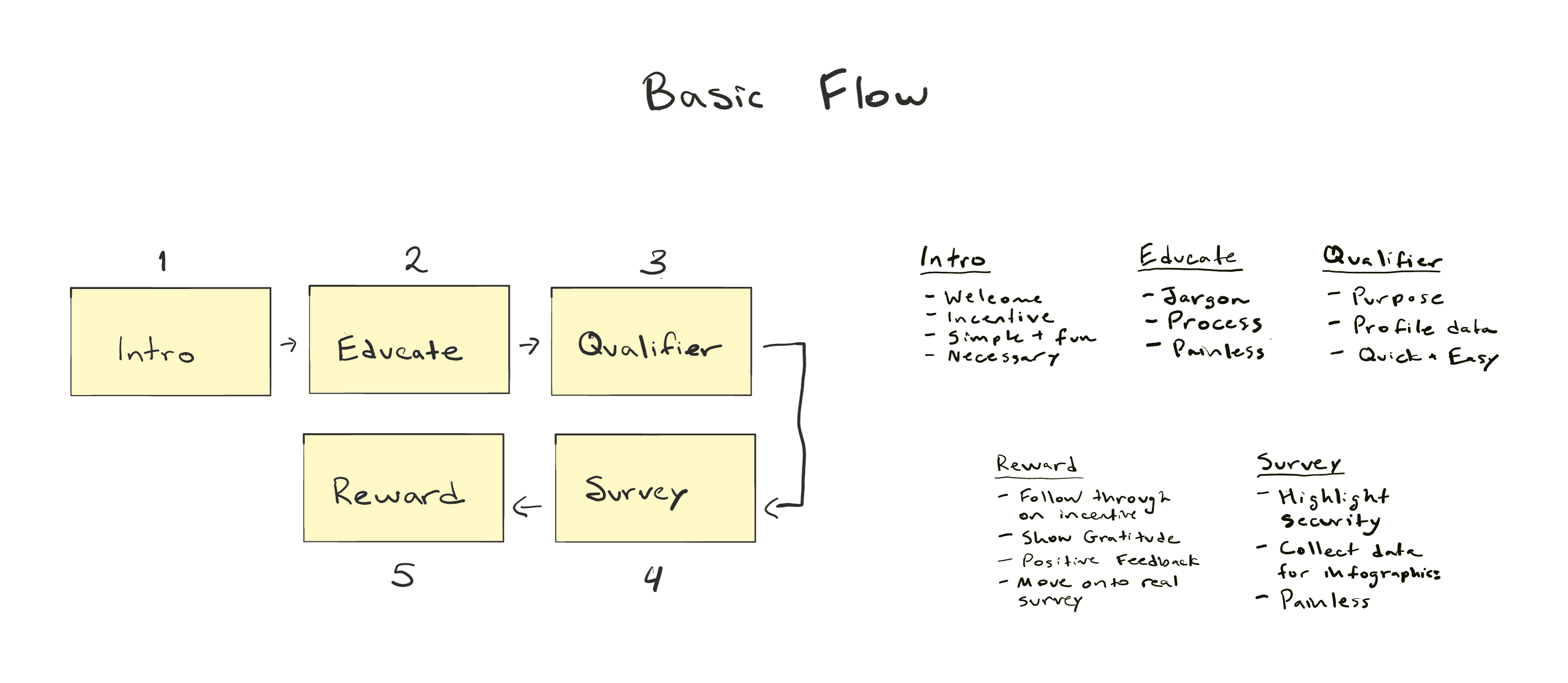
Next, I plotted the user's journey step by step.
1. An introduction that accomplished the following:
2. A brief education on the steps involved and language they would encounter taking live surveys
3. A qualifier that accomplished:
4. A survey that accomplished:
5. A status page that accomplished:
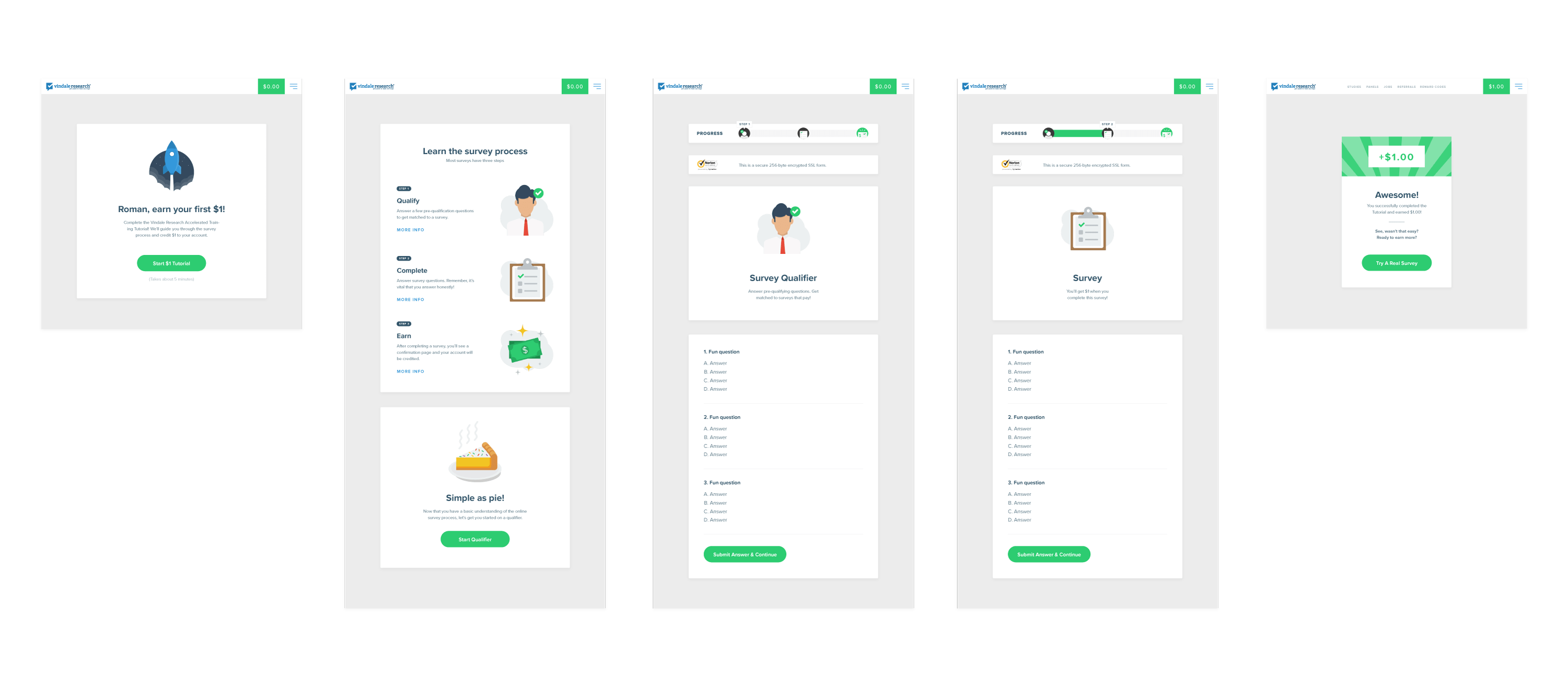
Our new onboarding flow was a unicorn in terms of user experience optimization: it was an instant success. We saw an increase in revenue, positive data that backed it up, and follow up surveys showed that this new batch of users was far happier and had a firmer grasp of market research processes and jargon. Of course, we had plenty of competitors that mimicked our onboarding flow. But, as a designer, is there any greater compliment than to be copied? And as a user experience designer, is there any greater accomplishment than making thousands of users' lives a little less frustrating?


