2019
Toolkit
This case study is unique in that it showcases my skills put to use strictly for brand identity and product development, rather than covering a data-driven iterative process or feature.
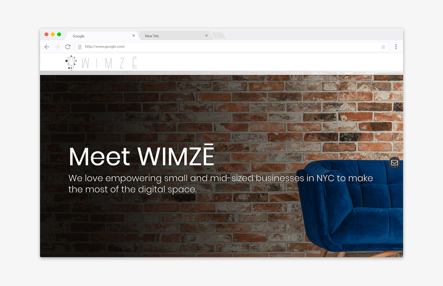
Wimze is an exciting young digital marketing agency in Brooklyn run by a couple of kick ass women. As they continued to improve their services and foothold in the industry, they realized their current branding was outdated and mismatched to what they saw as their desired aesthetic and tone. Time was of the essence, and I had a strict timeline of two weeks from day one concept to final delivery.
I had the pleasure of working with Wimze's creative director to come up with something fresh, exciting and modern. After a number of brainstorms and back-and-forth on design concepts, the team agreed on the following:
At this point, I had almost all the material I needed to get to work on the website, with a couple of exceptions:
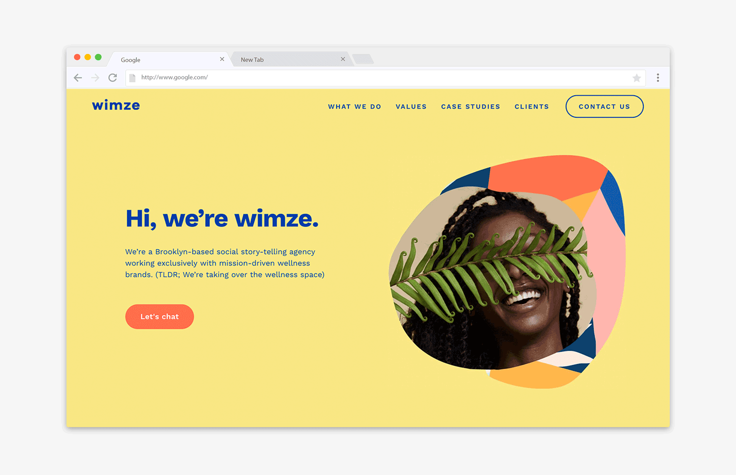
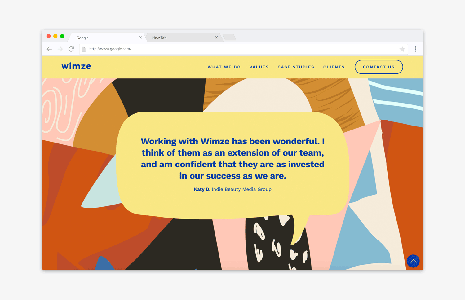
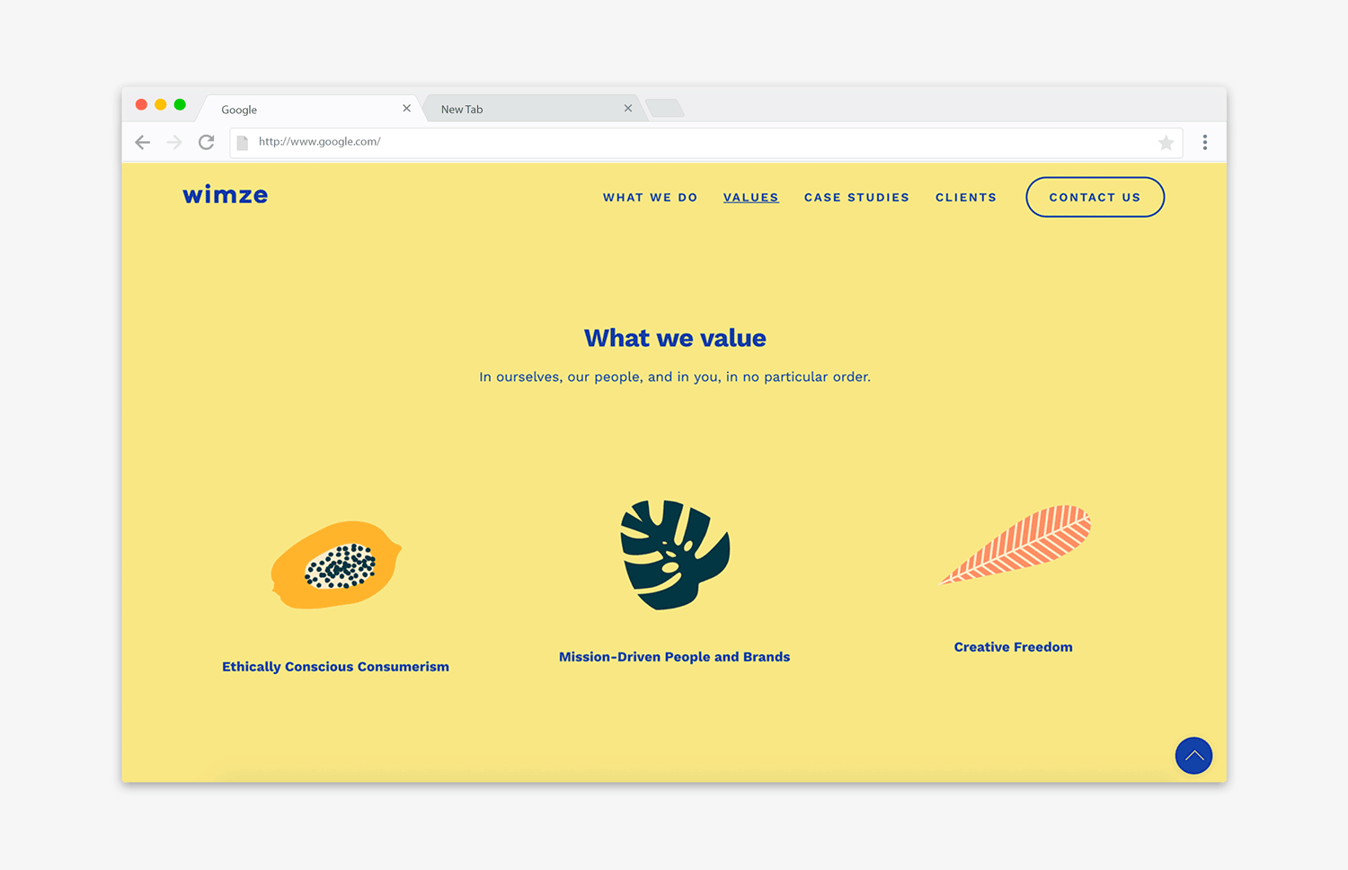
Together, the team and I decided on a visual identity that included a mix of elements from Matisse's compositional cut-out works, organic shapes like potatoes, leaves and flora (inspired by a concept I love—biomimicry), and colorful collage patterns to tie everything together.
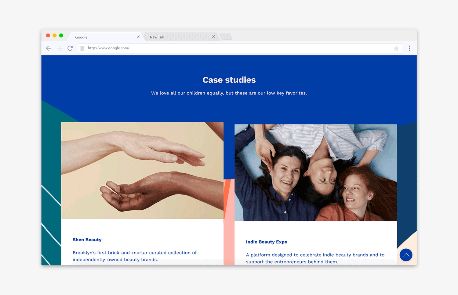
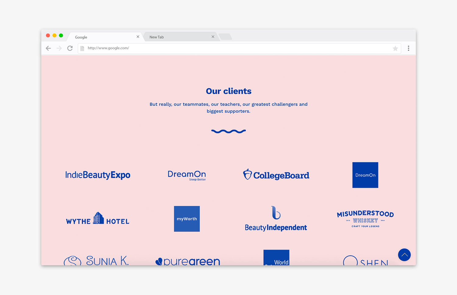
With all the elements in place, I created a wireframe and then mock up drafts of the website in Sketch. After a dozen or so iterations and adjustments to the copy, we had a final version of the site across device types that we all loved, and the Wimze team gave me the green light to build it out.
Since their team was well acquainted with Wordpress CMS and we were on a tight schedule, I decided on a Wordpress template that provided the basic functionality needed to bring my mockups to life quickly.
I completed the site build in 24 hours, with an additional day spent on refining broken layouts, applying transition effects, and ensuring the site looked awesome across devices. We invited friends and colleagues to weigh in, and I incorporated various edits collected from that exercise over another two-day period. Finally, I moved the project up to production and handed it off to the Wimze team.
Feel free to check out the site: Wimze Digital Site